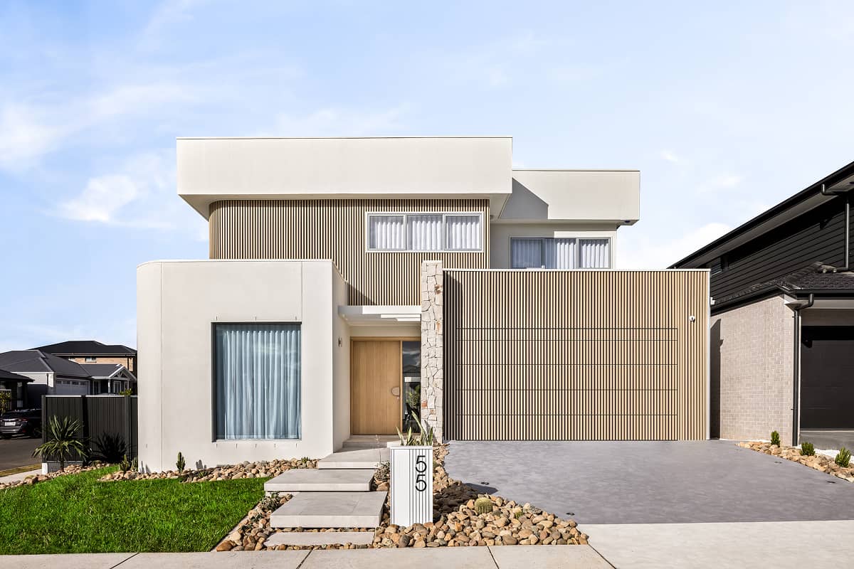
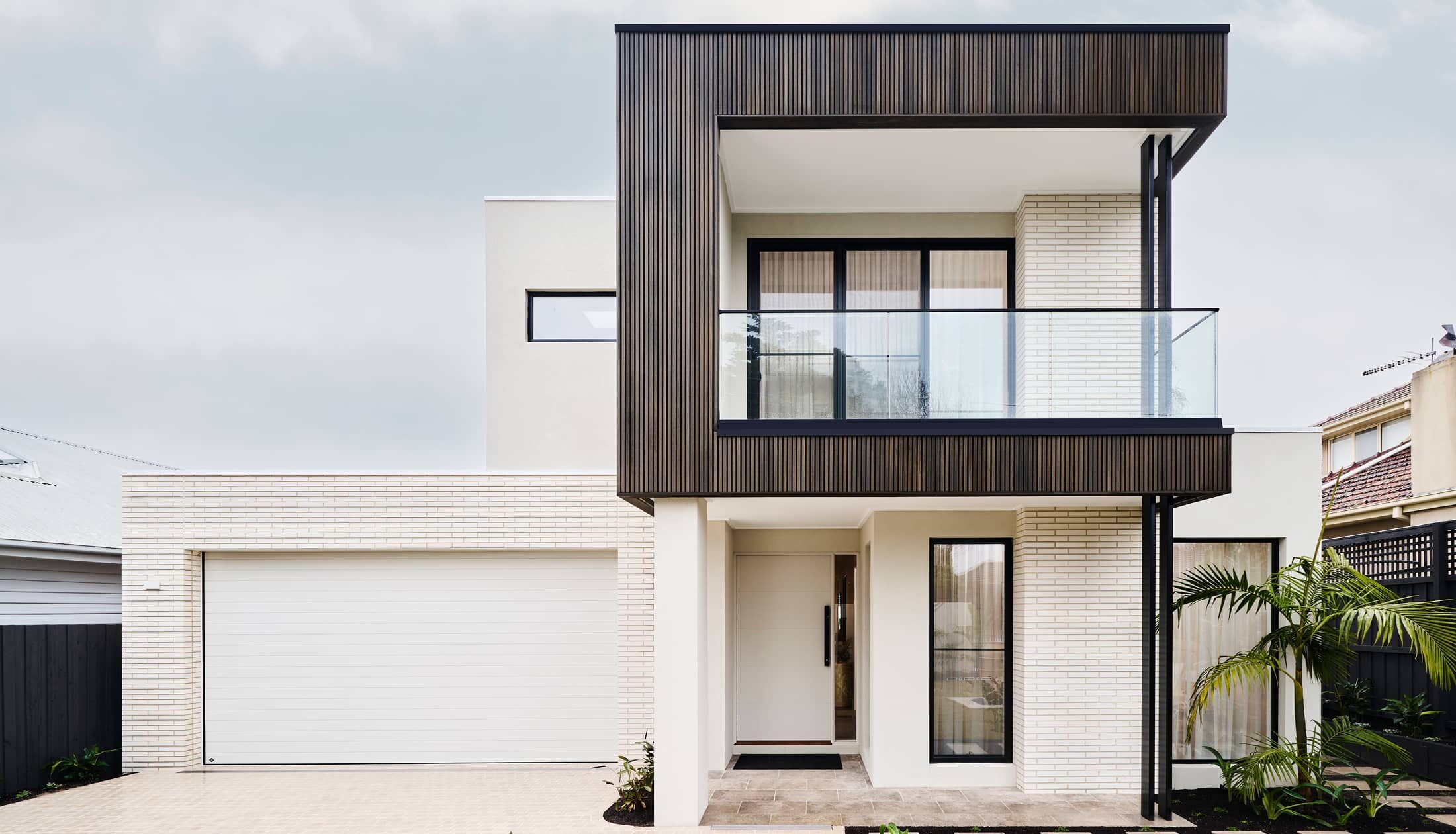
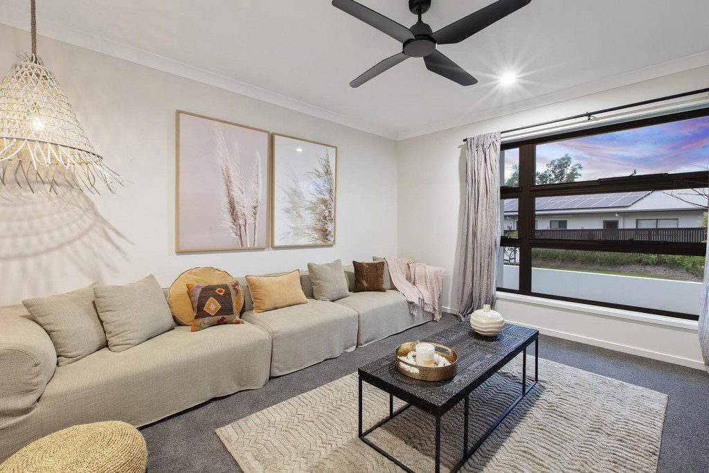
Choosing a colour palette for your home is a big decision. After all, it’s more than just deciding on a paint colour and buying some throw cushions. To do it right, you must consider all of the surfaces, finishes and inclusions across your whole home.
It’s understandable for this to seem like a daunting task, but by learning a few simple rules, tuning in to your personal preferences and following your gut, you’ll feel like a colour palette expert.
Before you start
Your floor is going to dictate a lot of your colour choices, including the colour of your walls and your furniture. Use the floor as the foundation for your colour palette in every room, and you’ll be off to a great start.
Make note of your lighting
Lighting will always affect your home interior planning – especially when it comes to colour. Depending on the availability of natural light, the season and the types of light bulbs you use, the hues and tones of your room will alter.
For example, the natural light in south-facing rooms bring out the best in cool and warm colours – dark colours will look brighter and lighter colours will glow! You may want to consider how you want your room’s colours to interact with the lighting, and how you can best utilise the light to amplify colour.
If you’re building a new home, your builder will be able to help you understand how your home is positioned on the block, and therefore how the light will affect your key living zones.
Consider the mood
Your colour palette is as much about creating a mood for your home as it is an expression on your personality. Remember that the selection of colours can determine the ambience of your space.
Warm colours are known to inspire vibrance and confidence and a great for promoting intimacy, while cooler tones can relax and bring a sense of calmness to your area.
Your personality and taste are crucial here. Trends come and go, and you want the mood of your space to really reflect who you are.
Remember colour theory
Basic knowledge of colour theory is a must when developing a colour palette. Finding the right foundation for your colour palette can help create clarity for your vision. The three basic colour schemes are:
- Monochromatic colours. These are various shade of the same colour. Choose a monochromatic palette for a more minimal aesthetic, adding depth with prints and patterns in your furniture and fabrics.
- Analogous colours. Often soothing, these colours are next to each other on the colour wheel and work to bring a cohesive and harmonious look to the home. Imagine blues paired with teals and greens.
- Complementary colours. By using two opposing colours on the wheel, like blue and orange, you can create an atmosphere of high-energy. Black and white, while not on the colour wheel, are also technically complements. This is perfect if you’re wanting a bold and dramatic look.
Be inspired by local landscapes
We are blessed in Australia to have such a stunning landscape – it would be a shame not to make use of it.
You could pay homage to the great Australian bush by adding pops of native greenery or be inspired by a nearing beach and include coastal tones. By featuring some natural elements, you can achieve a cohesive look with your outside environment. Plus, bringing the outside in is said to boost your overall wellbeing and happiness.
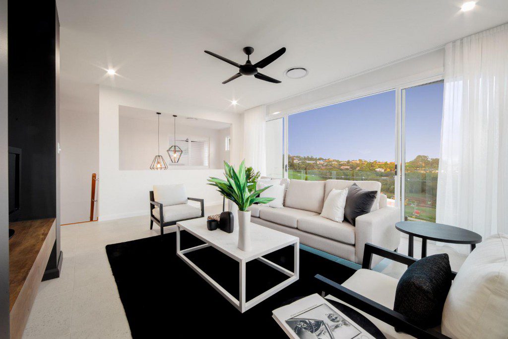
Colour trend: warm neutrals
Neutral tones are a tried-and-tested classic that aren’t likely to go out of fashion. Choose the right neutral colours and your home will exude pared back elegance and warmth. Think white paired with greys, browns or anything muted.
You can create a relaxed and peaceful environment by adding texture with rugs, cushions, and artworks.
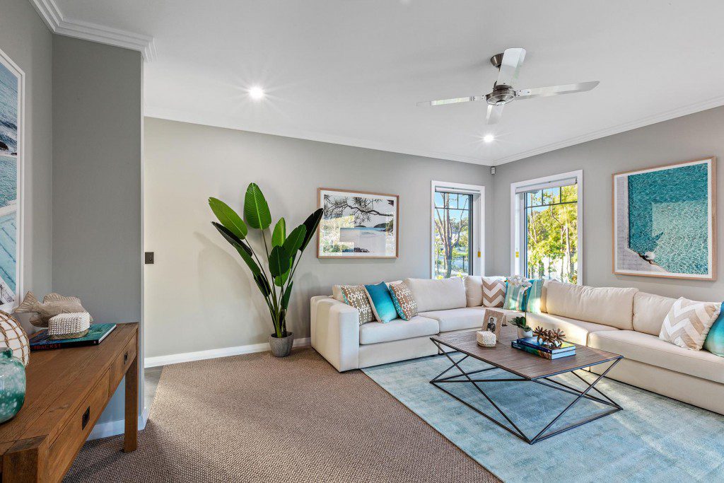
Colour trend: re-welcoming blue and green
Though blue and green never really went out of style, these two colours are well and truly back in the colour palette spotlight.
Blue tones can provide a peaceful and warm ambience to your home, while lighter shades can make the room feel larger. Green tones are a great way to bring nature into your home. They symbolise the natural elements of earth, clean air and encourage natural light.
Want to learn more about home design? Why not check out our Guide to Modern Hamptons Style.
Category
Design & Inspiration
Inspired by this post? Get curated home design advice delivered to you.
Related articles
Category
Design & Inspiration
Forget the after-work gym drives or time spent stuck in commuters’ traffic to make it to your exercise class, home…
Category
Design & Inspiration
Sustainable home design is not a new concept to many homeowners and builders. The premise has been around for years….
Category
Design & Inspiration
A new year calls for new inspiration! Whether you are looking to design your very own home this year or…
Category
Design & Inspiration
Front and center, the façade of any home truly sets the scene for any home design. After all, it is…
Category
Design & Inspiration
Since the most sought-after homes today feel light, bright and open, our team is committed to design choices that will…
Category
Design & Inspiration
There’s nothing quite like the ultimate freedom that comes with calling acreage home. That’s why an increasing number of young…
Category
Design & Inspiration
With summer just around the corner and sizzling temperatures en route, the appeal of a pool in your very own…
Category
Design & Inspiration
Our open plan home designs make kitchens the heart of the home to gather, cook and unwind. Our most recent…
Category
Design & Inspiration
Your investment property design offers the opportunity to improve your long-term financial position by enhancing the rental appeal, increasing property…
Category
Design & Inspiration
Contemporary home designs focus on both form and function to create the ultimate living experience. Often recognised by features like…
Category
Design & Inspiration
Holiday at home with the grandeur and glamour of resort style homes. Influenced by the oversized floorplans of tropical resorts,…
Category
Design & Inspiration
From considered cabinetry to aesthetic accents like feature walls, the true secret to creating beautiful homes is in the details….
Category
Design & Inspiration
In today’s work culture, a home office isn’t a luxury – it’s a necessity. Home office setups aren’t just for…
Category
Design & Inspiration
Hamptons style has long been embraced by Australian home design trends; despite being sourced from a coastal community all the…
Category
Design & Inspiration
Pantry designs have soared in popularity over the last few years as home wellness trends thrive post-pandemic. G.J Gardner Homes…
Category
Design & Inspiration
With work-from-home becoming our new normal, the humble study nook has transformed from an accessory to an essential. Whether answering…
Category
Design & Inspiration
Nothing competes with the comfort and relaxation of unwinding in front of the TV, and in the age of streaming,…
Category
Design & Inspiration
G.J. Gardner Homes’ kitchen designs offer plenty of pantry ideas that can be easily customised to your design preferences. We…
Category
Design & Inspiration
What’s an Aussie home without a generous backyard to play, unwind and enjoy all year round? Alfresco spaces have become…
Category
Design & Inspiration
Introducing a new height of luxury With so many exciting home features on offer today – from stunning alfresco spaces…
Category
Design & Inspiration
Let’s take this outside As open plan living continues to become the new normal for house design, the role of…
Category
Design & Inspiration
An outdoor kitchen is the perfect space to create some of your home’s most memorable moments. From garden parties to…
Category
Design & Inspiration
Indoor plants are a simple yet effective way to bring more warmth to your home. Not only do indoor plants…
Category
Design & Inspiration
Kitchens are the heart of the home – as the central hub of your home, we know the kitchen living…
Category
Design & Inspiration
In recent years, Hamptons style homes have emerged as a beloved source of home inspiration – renowned for their innovative…
Category
Design & Inspiration
Designing a home is one of the most exciting, yet challenging projects we choose to take on in our lives….
Category
Design & Inspiration
If you’re embarking on your first home building journey, choosing the right tiling for your bathroom can often leave you…
Category
Design & Inspiration
Whether you’re after a year-round holiday feeling or a home design that compliments the climate; coastal style homes are a…
Category
Design & Inspiration
Why is choosing an interior colour scheme so important? When you walk into a house, and you feel a sense…
Category
Design & Inspiration
Entertaining in Australia usually means one thing – the outdoors. No matter the season, time of the day or size…
Category
Design & Inspiration
1. Grey, Grey & More Grey With Hamptons’ style being so popular over the last couple of years, the glamour…
Category
Design & Inspiration
The new bathroom is looking pretty schmick, and it’s time to decide on the all-important details. Selecting tapware for your…
Category
Design & Inspiration
Choosing the exterior colours of your new home can be one of the most challenging decisions that you make during…
Category
Design & Inspiration
In Australia, we wear our homes like a badge of honour. We want our suburbs, our streets and our houses…
Category
Design & Inspiration
The laundry tends to go unconsidered during the design process, but this room majorly impact your home’s performance. Whilst…
Category
Design & Inspiration
As Australians, we love the outdoors. We love the sun, the fresh air, and the lush, feel-good greenery. That’s why…
Category
Design & Inspiration
There’s no denying that your bathrooms are extremely important areas of your home. Some think that a rain head and…
Category
Design & Inspiration
Hosting a dinner party? No matter what you do, everyone always ends up in the kitchen. Your guests are ether…
Category
Design & Inspiration
The Master Bedroom isn’t just any room in the house—it’s your private sanctuary. It should be your favourite room in…
Category
Design & Inspiration
Over the past 20 years, the kitchen has transformed from a hidden room in a home to a multi-generational, multi-purpose…
Category
Design & Inspiration
For a while now, an exclusive beachside community on the other side of the world has had a disproportionate impact…
Category
Design & Inspiration
From cladding to landscaping, windows and doors; a contemporary facade design will have your home crowned king of the neighbourhood. Read more!
Category
Design & Inspiration
Choosing the paint colours for your home is an exciting experience as you decide the overall look and design. However,…
Contact Us
"*" indicates required fields