1. Grey, Grey & More Grey
With Hamptons’ style being so popular over the last couple of years, the glamour of grey has become a common staple in our interiors.
Grey is the ultimate neutral colour that will work well with any furniture and accessories, and the right shade of grey paint will instantly form a subtle backdrop that makes your white skirtings & architraves pop.
There are many shades of grey that you can work within your home, but it’s important to realise that not all greys are alike.
To create harmony and a natural flow within your home, it is essential to understand the different types of undertones – warm and cool tones.
If you are looking for a more modern style home with a lot of natural light, cool greys will work well for you as they can often make a space look larger and feel crisp.
Cooler greys tend to reflect more blues, but you can also experiment with different strengths of colours to get the right hue.
When it comes to warmer grey tones, we are spoilt for choice. Warm greys can often be referred to as “greige” and are the perfect mix between pale grey and beige.
Warm greys are so versatile and are great for creating a more homely or cozy feeling within your house. If you are looking to go for a traditional Hamptons style home, warmer greys will be your palette of choice.
If you’re unsure if you want to go with a warm or cool undertone, work with your colour consultant to find great chameleon colours that can work alongside a cool or warm colour scheme.
Tip: Always remember to ground your greys with neutrals to ensure the room does not feel clinical. Greys work well with timber or stone, you can bring this in with floorboards, fireplaces & furniture.
2. White – Light & Bright
As Australians, we always seem to gravitate to the simplicity of whites. It’s a colour that will never go out of style and works in every home.
We are seeing a massive emergence in white interior colour schemes as homebuilders are looking to create a resort-style atmosphere, and whites are the perfect backdrop to bring the outside in.
The big question is how do you choose the right white, and there is a lot to choose from! Whites come in many different shades, and like grey colours, the most important thing to remember is all whites have an underlying colour.
To choose the right white undertone for your home, you need to consider how much light is coming into your rooms, your room size and window placement.
Cool whites have either a blue or green undertone and are great for adding a modern or minimalist edge to your home. They often make your room feel larger, are softer to the eye and are helpful in tempering bright light.
For a room that is flooded with light or if you are looking to obtain a more coastal look within your home, like our Mandalay display home in North Richmond, cool whites work particularly well.
Tip: Colours may change when applied to different areas of the home. From ceiling to wall, room-to-room or between walls, the same paint colour can look different. Make sure you test a white sample in various areas to get an idea of how the paint is affected by light in different areas of your current home.
Warm whites have yellow, pink or peach undertones and are the perfect partner for a classic interior or a home with less natural light. Warmer whites are excellent for south-facing rooms as the paint’s tones can warm up any space with their soft illumination.
3. Dark and Moody
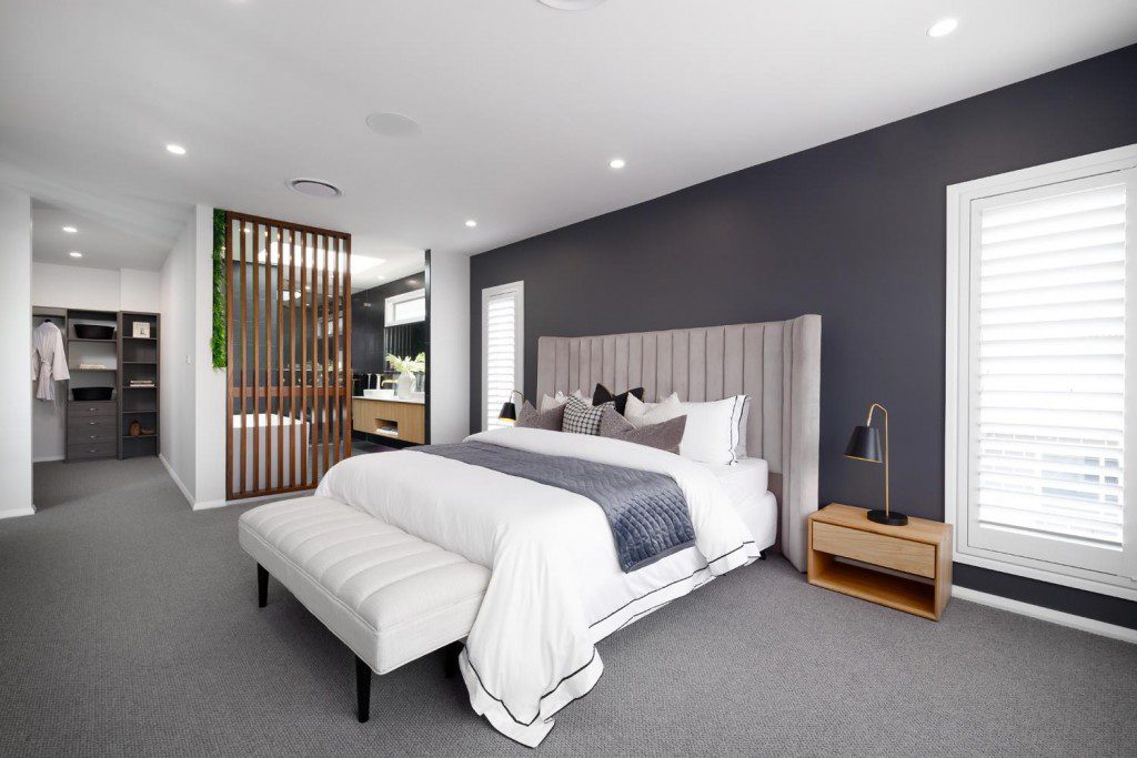
Dark interior designs have blown up in 2021, and we expect this trend to continue into 2022.
Dark colours don’t have to be limited to just greys and blacks. Deep charcoals, bottom of the lake greens, browns and inky blues can deliver depth, strength and warmth and make a room look and feel grander than it is.
When painting your walls a dark tone remember to keep the tone consistent. Warm undertones can ensure that your rooms are feeling alive and vibrant, while a cooler tone will keep the rooms calm and quiet.
Darker paints can also make other parts of a room stand out. For example, darker paints can draw attention to lighter-coloured furniture like beds, couches and dining tables, while richer-hued kitchen cabinets can make more neutral walls pop. When painting your walls with dark paint, we always recommend using accents of neutrals to ground the space.
If you don’t want to commit to a fully dark aesthetic but want to bring those moody vibes to your home, don’t be afraid to use a feature colour in a room where you are trying to create an ambience.
One good place to start painting your home with a dark paint is a media room. This is the perfect space to paint in a dark tone to avoid light reflection and ensure your picture on your TV or projector really pops.
Tip: Dark walls can show imperfections, so invest in scrupulous wall prep and high-quality paints.
Interior Colour Trends Tips
The most important thing is to limit the number of colours you use in your home and when you do choose colours, ensure they are from the same family, i.e. either cool or warm tones.
Creating a consistent palette that stretches across rooms can help give your home a more intentional look and create a visual flow of colour from one room to the next.
If you are not sure what colour palette or trend is right for your new home, get in touch with your local G.J. Gardner office and receive professional advice from our colour consultants.
Category
Design & Inspiration
Inspired by this post? Get curated home design advice delivered to you.
Related articles
Category
Design & Inspiration
Forget the after-work gym drives or time spent stuck in commuters’ traffic to make it to your exercise class, home…
Category
Design & Inspiration
Sustainable home design is not a new concept to many homeowners and builders. The premise has been around for years….
Category
Design & Inspiration
A new year calls for new inspiration! Whether you are looking to design your very own home this year or…
Category
Design & Inspiration
Front and center, the façade of any home truly sets the scene for any home design. After all, it is…
Category
Design & Inspiration
Since the most sought-after homes today feel light, bright and open, our team is committed to design choices that will…
Category
Design & Inspiration
There’s nothing quite like the ultimate freedom that comes with calling acreage home. That’s why an increasing number of young…
Category
Design & Inspiration
With summer just around the corner and sizzling temperatures en route, the appeal of a pool in your very own…
Category
Design & Inspiration
Our open plan home designs make kitchens the heart of the home to gather, cook and unwind. Our most recent…
Category
Design & Inspiration
Your investment property design offers the opportunity to improve your long-term financial position by enhancing the rental appeal, increasing property…
Category
Design & Inspiration
Contemporary home designs focus on both form and function to create the ultimate living experience. Often recognised by features like…
Category
Design & Inspiration
Holiday at home with the grandeur and glamour of resort style homes. Influenced by the oversized floorplans of tropical resorts,…
Category
Design & Inspiration
From considered cabinetry to aesthetic accents like feature walls, the true secret to creating beautiful homes is in the details….
Category
Design & Inspiration
In today’s work culture, a home office isn’t a luxury – it’s a necessity. Home office setups aren’t just for…
Category
Design & Inspiration
Hamptons style has long been embraced by Australian home design trends; despite being sourced from a coastal community all the…
Category
Design & Inspiration
Pantry designs have soared in popularity over the last few years as home wellness trends thrive post-pandemic. G.J Gardner Homes…
Category
Design & Inspiration
With work-from-home becoming our new normal, the humble study nook has transformed from an accessory to an essential. Whether answering…
Category
Design & Inspiration
Nothing competes with the comfort and relaxation of unwinding in front of the TV, and in the age of streaming,…
Category
Design & Inspiration
G.J. Gardner Homes’ kitchen designs offer plenty of pantry ideas that can be easily customised to your design preferences. We…
Category
Design & Inspiration
What’s an Aussie home without a generous backyard to play, unwind and enjoy all year round? Alfresco spaces have become…
Category
Design & Inspiration
Introducing a new height of luxury With so many exciting home features on offer today – from stunning alfresco spaces…
Category
Design & Inspiration
Let’s take this outside As open plan living continues to become the new normal for house design, the role of…
Category
Design & Inspiration
An outdoor kitchen is the perfect space to create some of your home’s most memorable moments. From garden parties to…
Category
Design & Inspiration
Indoor plants are a simple yet effective way to bring more warmth to your home. Not only do indoor plants…
Category
Design & Inspiration
Kitchens are the heart of the home – as the central hub of your home, we know the kitchen living…
Category
Design & Inspiration
In recent years, Hamptons style homes have emerged as a beloved source of home inspiration – renowned for their innovative…
Category
Design & Inspiration
Designing a home is one of the most exciting, yet challenging projects we choose to take on in our lives….
Category
Design & Inspiration
If you’re embarking on your first home building journey, choosing the right tiling for your bathroom can often leave you…
Category
Design & Inspiration
Whether you’re after a year-round holiday feeling or a home design that compliments the climate; coastal style homes are a…
Category
Design & Inspiration
Why is choosing an interior colour scheme so important? When you walk into a house, and you feel a sense…
Category
Design & Inspiration
Entertaining in Australia usually means one thing – the outdoors. No matter the season, time of the day or size…
Category
Design & Inspiration
The new bathroom is looking pretty schmick, and it’s time to decide on the all-important details. Selecting tapware for your…
Category
Design & Inspiration
Choosing the exterior colours of your new home can be one of the most challenging decisions that you make during…
Category
Design & Inspiration
In Australia, we wear our homes like a badge of honour. We want our suburbs, our streets and our houses…
Category
Design & Inspiration
The laundry tends to go unconsidered during the design process, but this room majorly impact your home’s performance. Whilst…
Category
Design & Inspiration
As Australians, we love the outdoors. We love the sun, the fresh air, and the lush, feel-good greenery. That’s why…
Category
Design & Inspiration
There’s no denying that your bathrooms are extremely important areas of your home. Some think that a rain head and…
Category
Design & Inspiration
Choosing a colour palette for your home is a big decision. After all, it’s more than just deciding on a…
Category
Design & Inspiration
Hosting a dinner party? No matter what you do, everyone always ends up in the kitchen. Your guests are ether…
Category
Design & Inspiration
The Master Bedroom isn’t just any room in the house—it’s your private sanctuary. It should be your favourite room in…
Category
Design & Inspiration
Over the past 20 years, the kitchen has transformed from a hidden room in a home to a multi-generational, multi-purpose…
Category
Design & Inspiration
For a while now, an exclusive beachside community on the other side of the world has had a disproportionate impact…
Category
Design & Inspiration
From cladding to landscaping, windows and doors; a contemporary facade design will have your home crowned king of the neighbourhood. Read more!
Category
Design & Inspiration
Choosing the paint colours for your home is an exciting experience as you decide the overall look and design. However,…
Contact Us
"*" indicates required fields